Thursday, May 5, 2022

Last Two Weeks and End of STEM/TRAIN

 We have finally reached the end of the semester. I loved seeing everyone's presentations; it is interesting to see our different interests, what we are all curious about and how we approach what we are curious about in our interests. I have no finals for the next two weeks, but I have final projects that are always a heavy load, but it is just a review of what we have been doing all semester, so it will just take time to accomplish. I do have plans to work on the Batmon website this summer and take on renovating my mother's website for her personal business. I want to be able to add these two websites to my portfolio to hopefully show in the future. I will be taking all the information I learned through my research and applying it to real-life scenarios, such as these two websites. The goal is to get batmon to at least the first or second page with what I learned. It will take many tries and practice runs, but practice makes perfect.

Image from: https://unsplash.com/photos/shr_Xn8S8QU
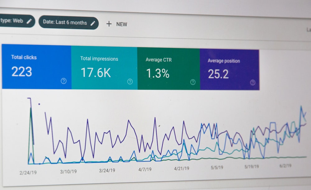
monitor screengrab

Thursday, April 28, 2022

Final Paper and End of Semester

 We finally are heading towards the end of the semester. Although it can be a relief, it also is a time where there is the most work. I thankfully do not have finals this semester but I have multiple huge projects and the final presentation to work on. I am thankful for the projects since my moving situation took what I felt like the entire semester. I told Josh I will most likely finish the Batmon website before the summer ends, but I ran out of time to actually perform an experiment on the old Batmon website and the new Batmon website. I have so much information I found for the alternative method which I ended up switching to observation because there were a couple studies that already did what I wanted to do, which was they improved a website using search engine optimization and had a survey for a group of people to rate the website and also measured the number of visitors, duration of the time on the new website versus the old website. This particular study is the main focus of my research and I plan to make it the focus of my presentation. 


Thursday, April 14, 2022

Crucial Landing Page

 In my internet/web development class and also through the research I have been doing for my project I have learned that a website landing page makes or breaks a situation. Also, in my e-commerce class we have been learning about different aspects of a website and an actual company, ora brush, had tripled its conversion rate because of its outstanding landing page. I decided to look at their landing page and saw why, it has great categories, a straightforward page with a logo, a classic hamburger menu on the left, and great product photography. I already have the logo, menu I just am stuck on the images but the structure is well on its way.

So, I have been learning in multiple classes the importance of an awesome learning page. With that, I have been searching for the perfect images that are free within the Wix platform to include on the website. We do not have many images to work with other than the Batman Logo and a few screenshots of the levels. Although it is not a problem an awesome website can be made with free images from Wix, I have seen it done before. 

Information from: https://www.prioritytextbook.com/e-commerce-2021-business-technology-and-society-16th-edition-kenneth-c-laudon-and-carol-guercio-traver/?gclid=Cj0KCQjwjN-SBhCkARIsACsrBz7Z837eBisXYLexnaVfyKJlpanJUhwRvaEAPs45EsYla2tuMMgl4uUaAsGEEALw_wcB 

Orabrush image from: https://www.dentek.com 


Thursday, April 7, 2022

Research Paper Rough Draft

 While writing and planning my research rough draft, I found a couple extra articles which really drew my attention and had more important factors of website analytics. I found a new factor called the bounce rate. The bounce rate is basically how long it takes for an individual to leave the website for whatever reason. The major reasons that a website has a high bounce rate are because there is insufficient content meaning that the website could be too small, low-speed navigation, meaning the website's loading speed is slow, and insufficient security, meaning they do not trust the website. If there are any of these negative factors, the individuals will almost immediately leave the website. When these factors are addressed, the bounce rate decreases, and the percentage of the organic search engines increases. 

Information and image from: doi:10.3390/bdcc4020005. 


Thursday, March 31, 2022

First step - Mobile Design

 I have finally been able to start the new website design; I am making it a goal to finish the website before the semester ends, so now I am thinking I might have to use other research articles to do my final project. In my internet/web development II class, my teacher taught us to begin with the mobile design first as most users today use mobile devices. So, this week I have been working on the primary foundation of any web page, the home page, and the mobile design. 

I went with the standard hamburger menu on the top left side because the top-left hamburger menu is very intuitive for individuals in the same class I mentioned. I also placed the logo in the top center of the website, the intuitive or customary placement for logos is the top center or top left, but I found the top left too close to the menu. Lastly, I did finish the footer which mainly needs the basics of every website, including legal, contact information, and the brand.

The mobile design must be intuitive for the user to navigate easily and not be scared off by a complicated or different site. Currently, I decided to go with the traditional black and white colors that the Batmon Logo has a bright blue to add a little color since some color is popular among middle-schoolers websites. Most of the gaming websites I saw for ages middle school and up had black, white, and maybe one color. Also, I am still planning the homepage. I need more images and need to write content for the page. The next step after finishing the home page is designing the other pages. 


Here is the top of the website preview and the menu (menu pages will change): 


Here is the bottom footer (not done):


Thursday, March 24, 2022

ER and Design

 This week started off bad; I went to the emergency room on Monday and was released that same night. What I have is not serious and the major symptoms that affect me the most should be gone in a week, and the illness will go away on its own, too; it is not COVID, thank goodness. Although it makes me want to hurry up and get better to get my booster shot. I have been very sleepy and woozy from the medicine and antibiotics, so I have taken it slow, but I hate doing nothing. This week I just further planned my design and researched analytics information. This week in my e-commerce class, our chapter included website analytics terms and ways for businesses to use these analytics for their benefit. Specifically, what caught my attention is that I need to focus my research on unique visitors because views and page hits are not the best. The reason views are not the best is because one visitor can view a page or page(s) multiple times, and hits are only HTTP requests, meaning it does not guarantee the visitor stayed for long or their behavior. Also, I learned about algorithms; I was not aware that Google has different algorithms that are put to use, and it is important to be aware of them and manage them for the best search engine marketing results. For example, an algorithm named Panda sought to eliminate low-quality websites from search results. Due to this algorithm, the importance of high-quality, aesthetically pleasing, and great Search engine keywords is crucial to appear in a search engine result. 


Kenneth C. Laudon; Carol Guercio Traver. E-Commerce 2021. Pearson. 

Image from: https://unsplash.com/photos/zhZydTyNMPg

Google logo screengrab

Thursday, March 17, 2022

Inspiration and Mobile Layout

 I know we are on spring break and it has been very relaxing but I started working on the setup of Batmon's website using Wix. Wix is a platform to develop websites quickly. I could try to code everything from scratch but for a beginner that would take a lot more time. So, I set up an account and started drawing out my basic concept for the website first on the mobile layout. In my internet/web development course, we are taught to start with a mobile design first and that is what I started doing already in the image below. I am still planning the content but now have a more clear idea of what content will go in each section. I know Wix has analytics but I need to look more into Google analytics since my main focus has been on SEO and some design research. I have the color palette down so far and the layout below. I need to next find out what pages the website will have in the menu. 


Thursday, March 10, 2022

Accessibility, SEO and Content Optimization

While finding research for my project I found what I believe will be my main 3 factors for the research behind making a website's design competent. The three factors are accessibility, SEO strategy, and content optimization. A website's design must be aesthetically pleasing, have the proper color palette, and it must have accessibility features for individuals with disabilities. While writing and editing my background paper, I found that individuals with disabilities actually use the internet more than those without disabilities. I also found that internationally, a study found that in most countries more than twenty-five percent of the population do not reach adequate literacy to participate fully in society. Hence, the importance of accessibility on web pages should be equally important to the content and functionality. On my own, I see there are a lot of websites that do not have accessibility features, even large companies who have professional websites sometimes tend to lack accessibility features. Below is an image of the workflow that should be followed for designing an accessible website. 

Image and information from: https://www.sciencedirect.com/science/article/pii/S1877050912007934 


Thursday, March 3, 2022

Rephrasing Research Question and SEO

I was able to rephrase my research question, and Josh helped me narrow down my research topic to where I can still use the research articles I have already gathered so far. Josh also helped me find some research articles because he has a talent for keywords. Once again, search engine optimization is emphasized while researching this project. I seek to answer why a website is so important to have a great SEO ranking? From what I have read about search engine optimization, the answer is to increase website traffic; the website must have the correct SEO methods to have a higher rank on tons of websites. Research shows a large percentage of website traffic comes from search engines. In addition to great SEO rankings, the website must also have these major components: Usability, Accessibility, and social media to promote websites. 


Information and image from: https://ibimapublishing.com/articles/JIEBS/2016/969476/969476.pdf 


In my CIS233DA Internet/Web Development, we have learned that usability and accessibility are CRUCIAL for websites because users will not stay if the site is not intuitive enough. Companies can actually get sued for lack of accessibility. We have also learned that most of the American population has problems with accessibility, such as color contrast, further emphasizing the importance of accessibility. I know I have to find a way to import accessibility features into the website and make it very easy and intuitive to navigate. 

Information from: https://www.teaching-materials.org/accessibility/#/13 

Thursday, February 24, 2022

Youth Website Appeal

Aside from researching how to bring traffic to a website, I have been really excited to start playing with design elements but the planning process of a website takes a while. I could not resist the curiosity and started researching potential colors for the website. I first started by searching what colors appeal to middle school kids and I saw a lot of brighter colors but not too bright, they were not super bright neon colors. The super bright neon colors appear a little more to younger kids. The audience for the website is middle schoolers and above, and I saw that most gaming websites have black incorporated along with color. I was already thinking of doing this, so this quick research makes me happy that I was correct. This week I have learned that search engine optimization, a phrase that is thrown a lot in website development is crucial to driving traffic. I researched many articles to get an idea of what it is and how I can practice it to master it and bring numerous organic traffic to the website. I really want to get started with the design already but I know planning is essential before designing. As you can see in the picture below this website capcom.com has an image of Disney's castle of illusion game which is rated for ages 9+, along with the age range of middle schoolers, my target audience. The website image of this game has color but it also has a lot of dark elements like the castle and the forest, further supporting my findings that middle schoolers and above color appeal are colors that are not so bright with black or darker colors.  

Image from: https://www.gamingdebugged.com/2013/10/20/five-coolest-mainstream-video-game-studio-websites/ 


Thursday, February 17, 2022

Research Proposal

Why did no one remind me how stressful and time-consuming moving is? It has been quite a challenge trying to get work done while helping my family move and clean. My research proposal is based on what web design elements can make a website more appealing. The importance behind website appeal is the impression on the target audience and getting and keeping their attention. This is essential because one visit to a website can determine if the user will want to know more and become a regular visitor/user or leave and never want to come back again. Surprisingly, the focus on website design for mobile devices has been more popular than desktop computer websites. I wonder if mobile devices will eventually be everyone's only device. The most important piece of research that stuck with me was that a website can do so much for a brand or company. It is equally important for businesses selling a product or service for an information-oriented website. 

cardboard box lot 

Image from https://unsplash.com/photos/fyaTq-fIlro 

Last Two Weeks and End of STEM/TRAIN

 We have finally reached the end of the semester. I loved seeing everyone's presentations; it is interesting to see our different intere...